Letterhead Looks Faded in Word? Here’s What’s Actually Wrong
By the WordLetterhead Team · Last updated:
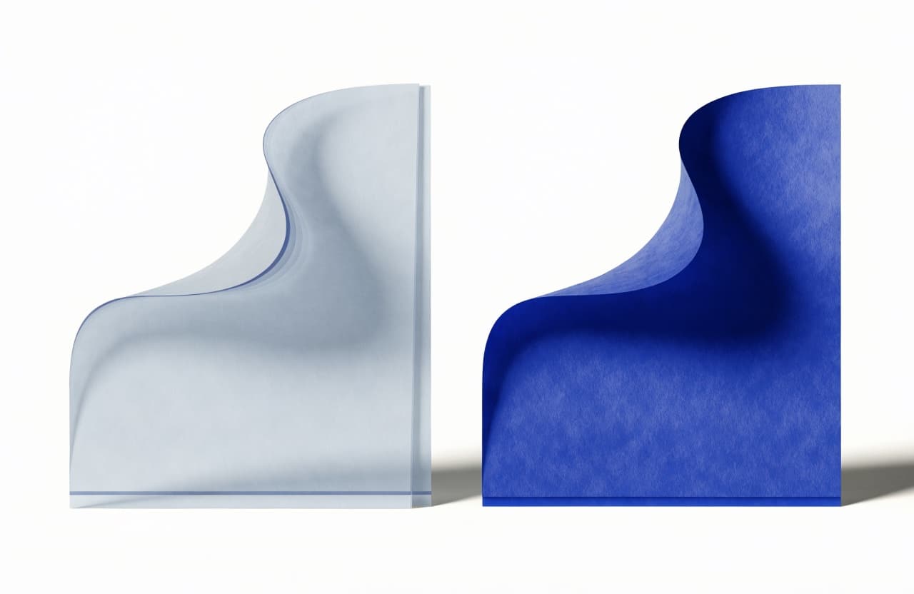
A faded letterhead in Word is one of two very different things: a harmless on-screen dim that prints at full strength, or a watermark that prints washed out on purpose. One test page tells you which one you have.
Why does the letterhead look faded while I type?
If the artwork sits in the header, nothing is wrong. Word dims header content on screen while you type in the body — it’s a signal showing which layer is active, not a change to the file. The printed page comes out at full strength, every time.
This is the most common case by far, and it needs no fix at all. Print one test page and watch the “fade” disappear. (If the design is missing from the print entirely, that’s a different problem with a different cause: letterhead disappears when you print.)
When will it actually print faded?
When the letterhead was inserted as a picture watermark. Word’s watermark feature washes images out by design — its job is to sit faintly underneath readable text — so a letterhead that went in as a watermark prints pale no matter what the original file looks like. That’s not a settings problem; it’s the wrong home for the artwork.
The washed-out watermark is one of the three failing methods in every method compared — it repeats nicely and locks nicely, and prints wrong forever.
How do I get letterhead that prints at full strength?
Put the artwork in the header as a normal image — not a watermark. That’s exactly how WordLetterhead builds the file: your design as a locked, full-page header image at 300 DPI that dims politely on screen and prints at full color on paper.
- Upload your letterhead — PDF, PNG, or JPG.
- Drag the typing area over the space the design left open.
- Download the .docx and print a test page — full strength.
The watermarked sample is free — print it and check your own printer before paying. $9one time, no account.
Common questions
- How do I tell which case I have without guessing?
- Print one page. If the letterhead comes out at full strength, it was the on-screen dim — normal, harmless, done. If it prints pale, the artwork went in as a watermark and needs to move to the header layer as a regular image.
- Can’t I just make the watermark print darker?
- You’d be fighting the feature. Word’s watermark exists to sit faintly under readable text — washing the image out is its job. Letterhead artwork belongs in the header as a normal image, which prints at full strength without any adjustment.
- Will my recipients see the letterhead faded too?
- On screen while they edit, yes — same dim, same reason, and it tells them the design is safely out of reach while they type. Any printed copy, theirs or yours, comes out at full strength.
- Does the free WordLetterhead sample print at full strength?
- Yes — it’s a working .docx built exactly like the paid file, with a watermark over the artwork. Print it, confirm the colors and strength on your own printer, then pay the $9 only if the file earns it.